
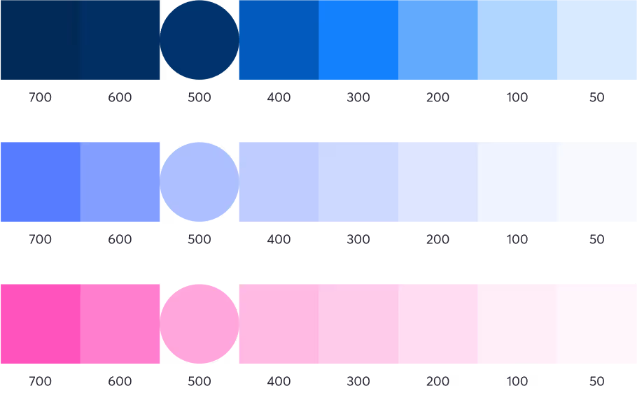
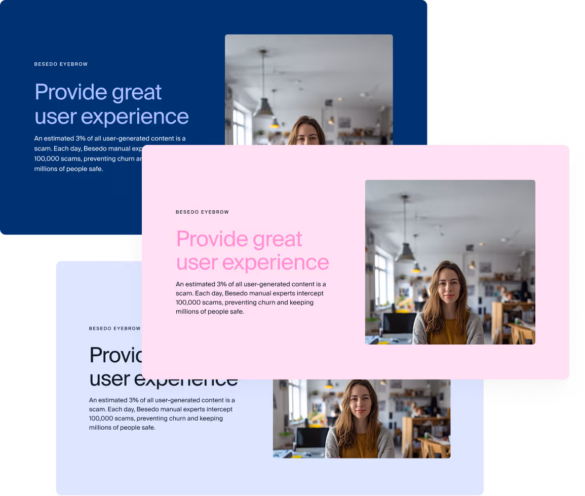
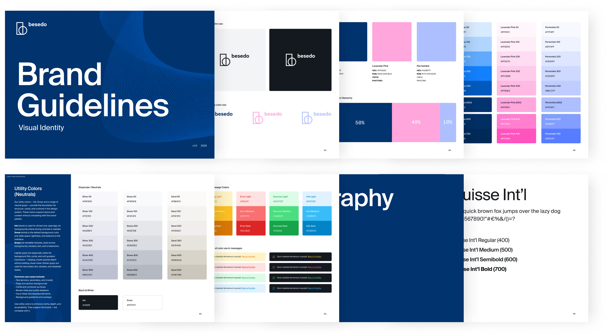
Brand Colors
Besedo already had a solid brand palette, so I focused on refining it. I adjusted a few tones—giving the pink more room to shine—and built out tints and shades to work across web, UI, and social. I also created clear, practical guidelines for color combos to keep things consistent in everyday design work.


A new direction in type
Besedos previous typeface felt too playful. We needed something more mature, clean, and versatile. I knew I wanted to go with something rooted in Swiss design, and we landed on Suisse Int’l as the new primary typeface. To support it, I also selected Suisse Works and Suisse Mono from the same family as complementary styles.


Typographic scales
I defined a full set of typographic rules for web use—covering headings, body text, and UI labels across all breakpoints. The type scale was carefully built to flow smoothly across different devices and screen sizes, creating a clean, readable experience from mobile to desktop.

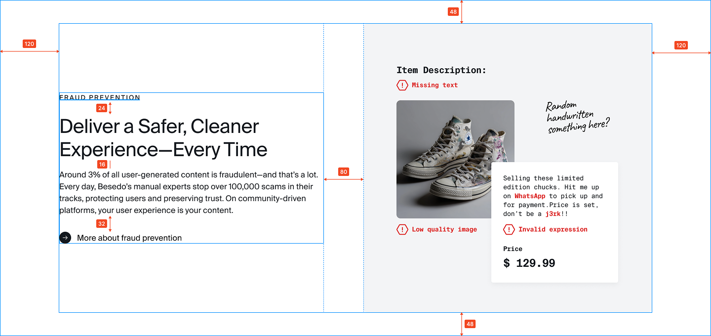
Simplifying the visual language
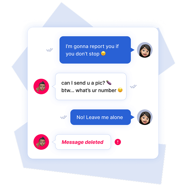
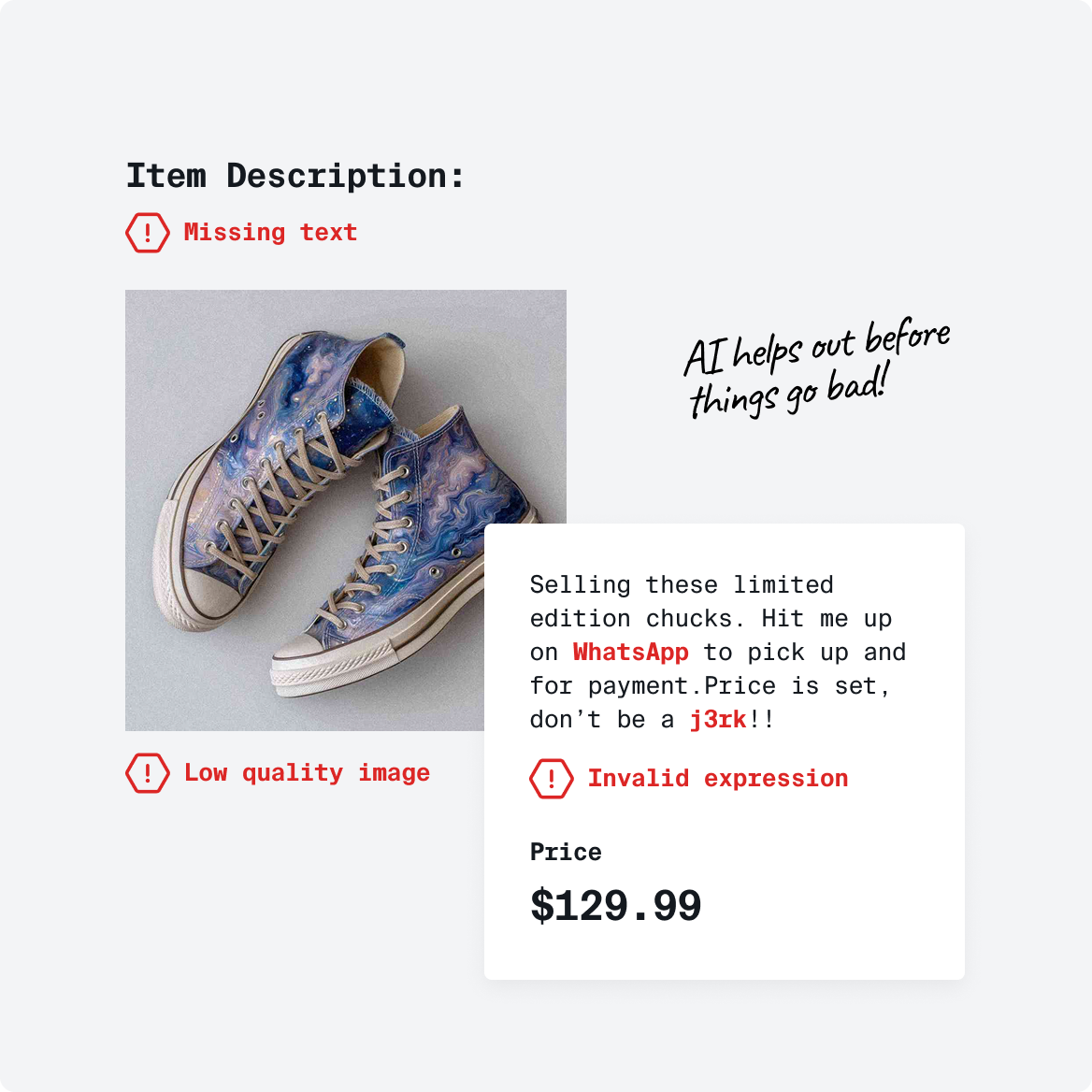
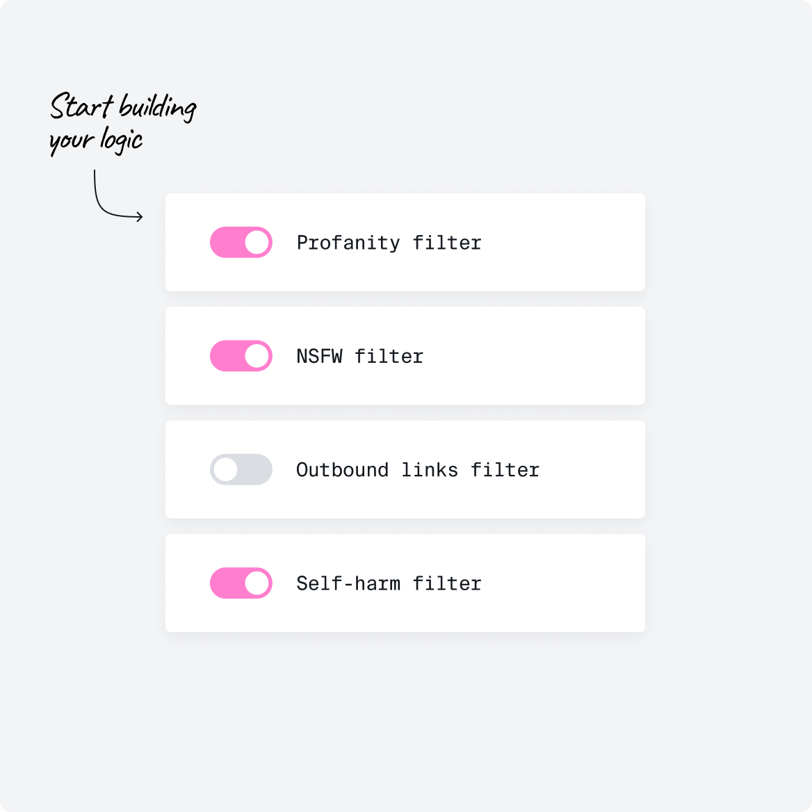
Besedo’s illustration and imagery needed a refresh to match the cleaner, more grown-up website. I simplified how UI elements were shown, reduced detail, and added a mono font to tie things together. A hand-drawn font brought back some personality and playfulness from the old brand. The end result: a lighter, minimal feel that fits the new direction.
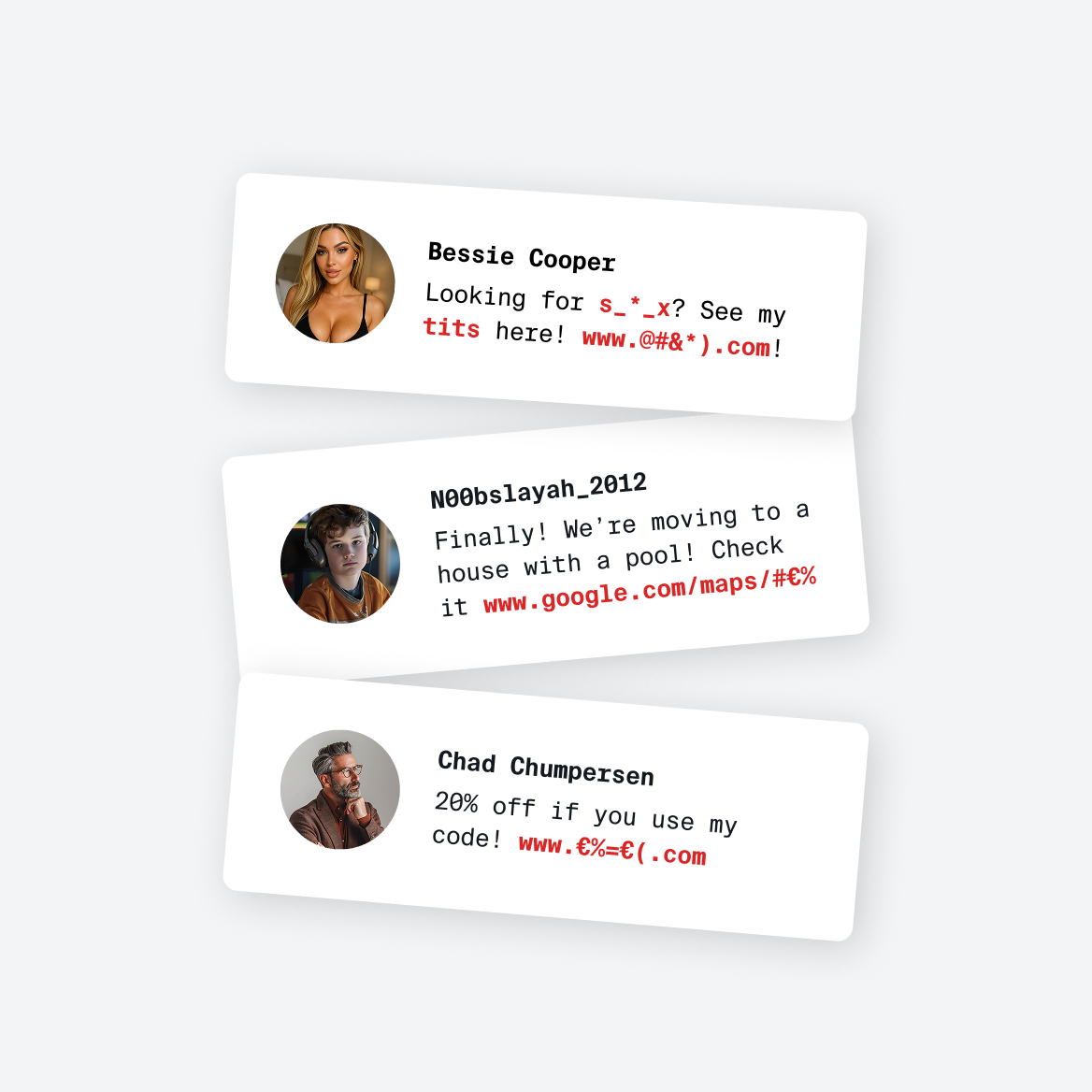
Colorful cartoony graphics & detailed UI
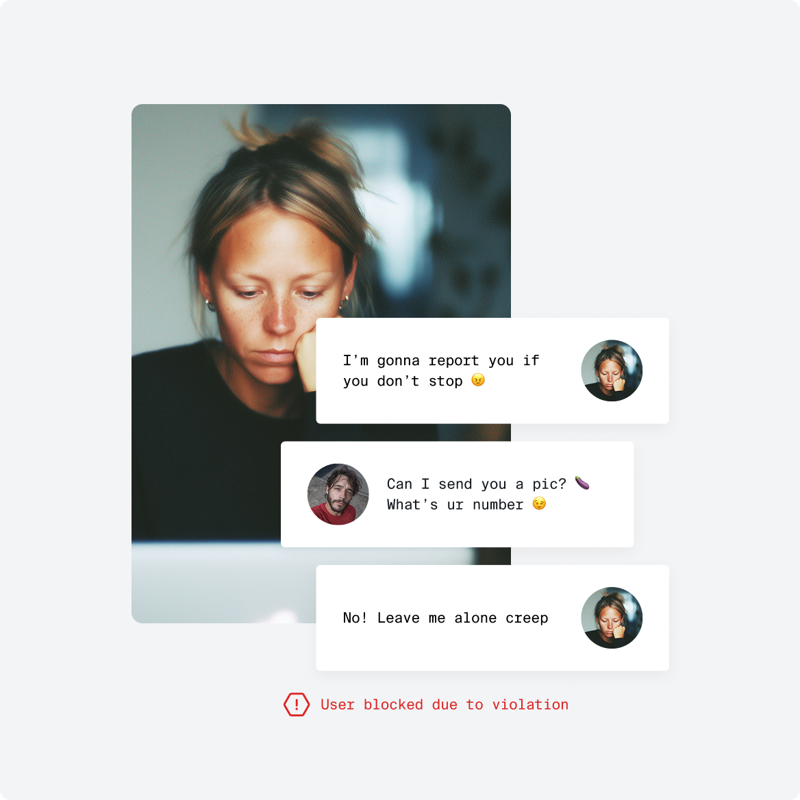
Simplified, Light & bright. Real people. More grown up look.
"I’ve had the pleasure of working with Sebastian numerous times over the years, and gosh darn it he is talented. What sets him aside from other designers is that he really cares about delivery – both quality and pace.
He is fast, talented, and delivers above and beyond – a triple threat."
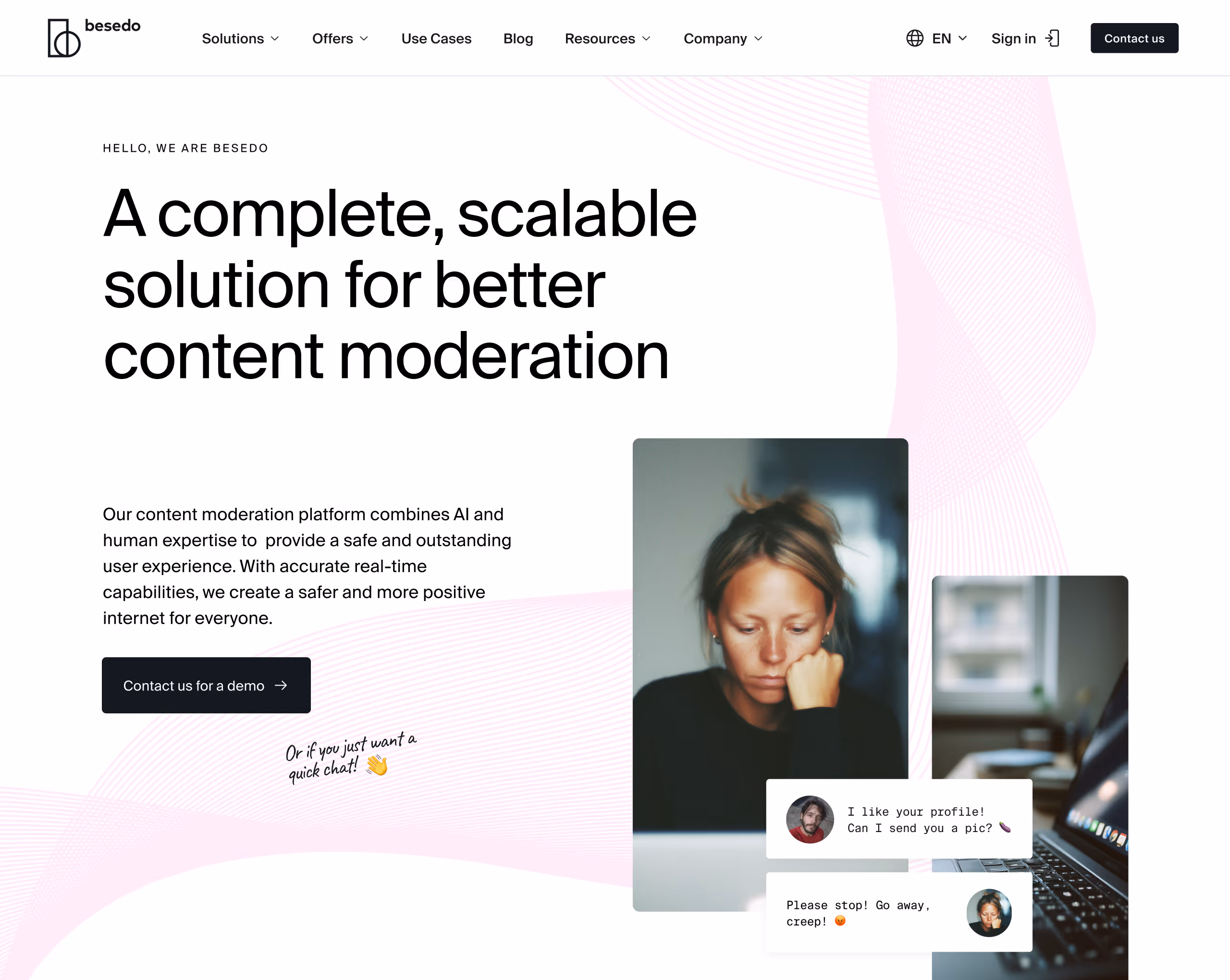
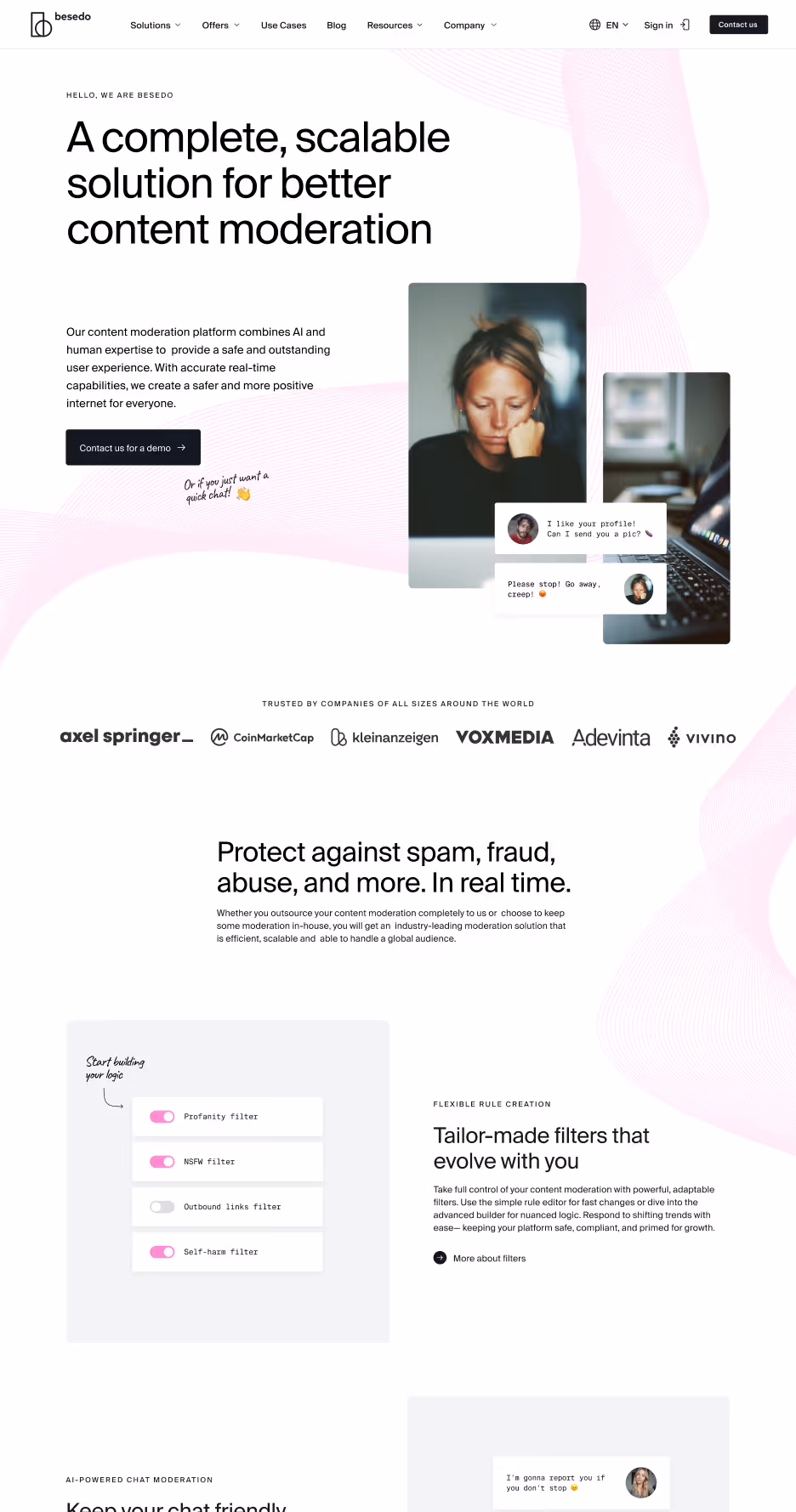
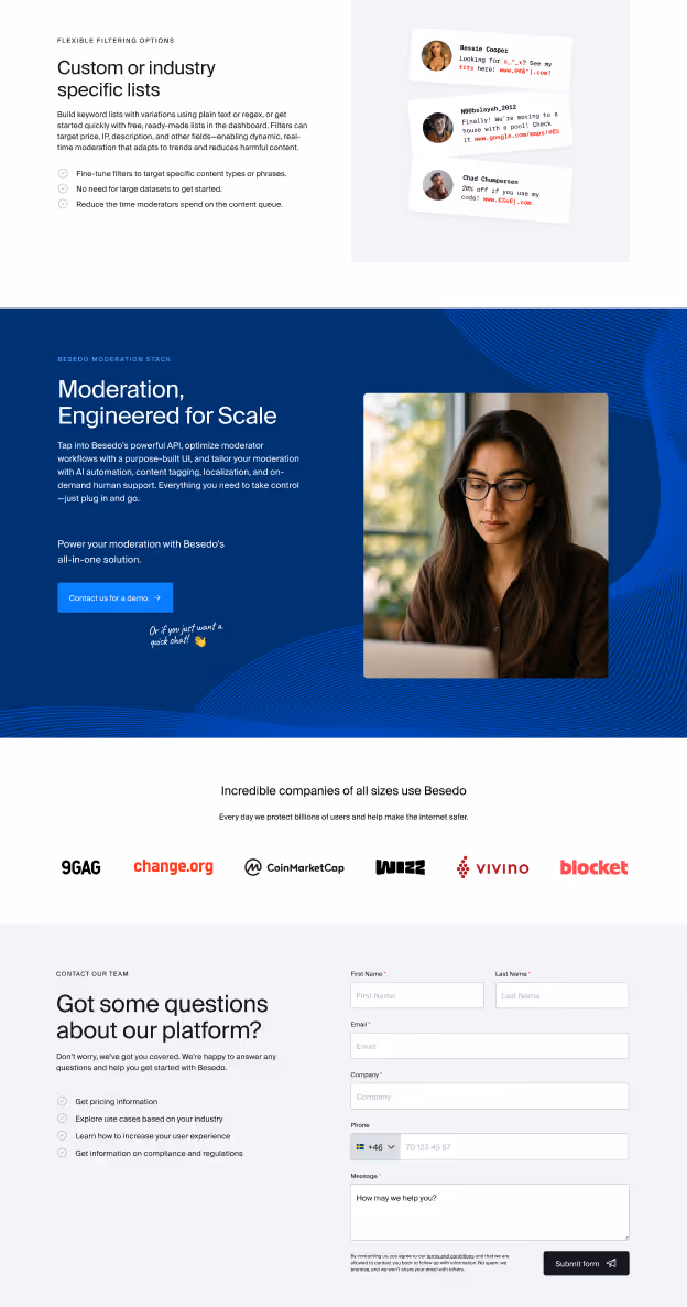
A visual refresh for the Besedo website
Besedo wanted to move away from the old, playful and cartoony look—limiting colors, brightening things up, and aiming for a more grown-up, refined style that still had character. I worked through the site and created a set of components based on the new direction.
Instead of chasing flashy concepts, I prioritized usability and built a flexible set of components that both designers and developers could easily work with, helping them get pages out faster.
A flexible, future-ready component library
I pulled all the components I designed into a solid Figma library—complete with styles, variables, colors and other elements. It gives Besedo a clear visual system to build from and makes it easier to stay consistent as they grow.
Smaller fixes that add up
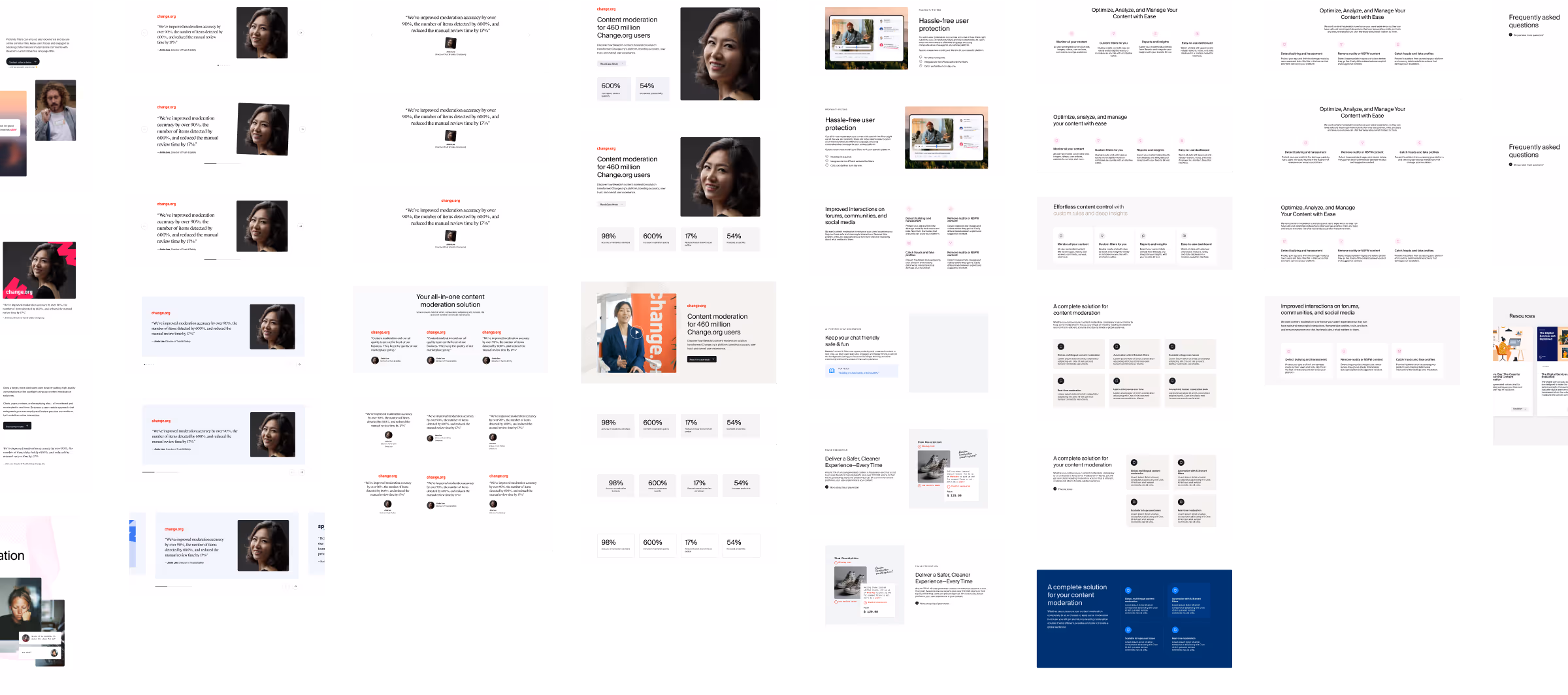
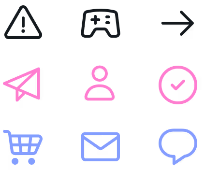
I also took care of a bunch of smaller things—like reworking the buttons and setting rules for how to use them, picking an icon library that matched the new look, and choosing neutral utility colors for both web and marketing use.

A living document for a growing brand
I put together a Visual Guidelines doc to bring together everything we’d defined—color usage, typography, imagery, logo rules, etc. It’s a go-to reference for anyone working with the brand and gives Besedo a solid base they can keep building on as things evolve.
A fun and focused refresh that touched a lot of moving parts. I got a lot done in a short time, and the work sets up Besedo with a solid foundation to build on.
fin.
More projects