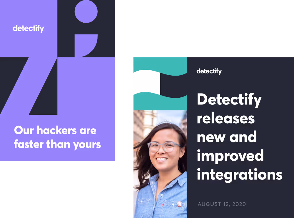
Detectify on the Web
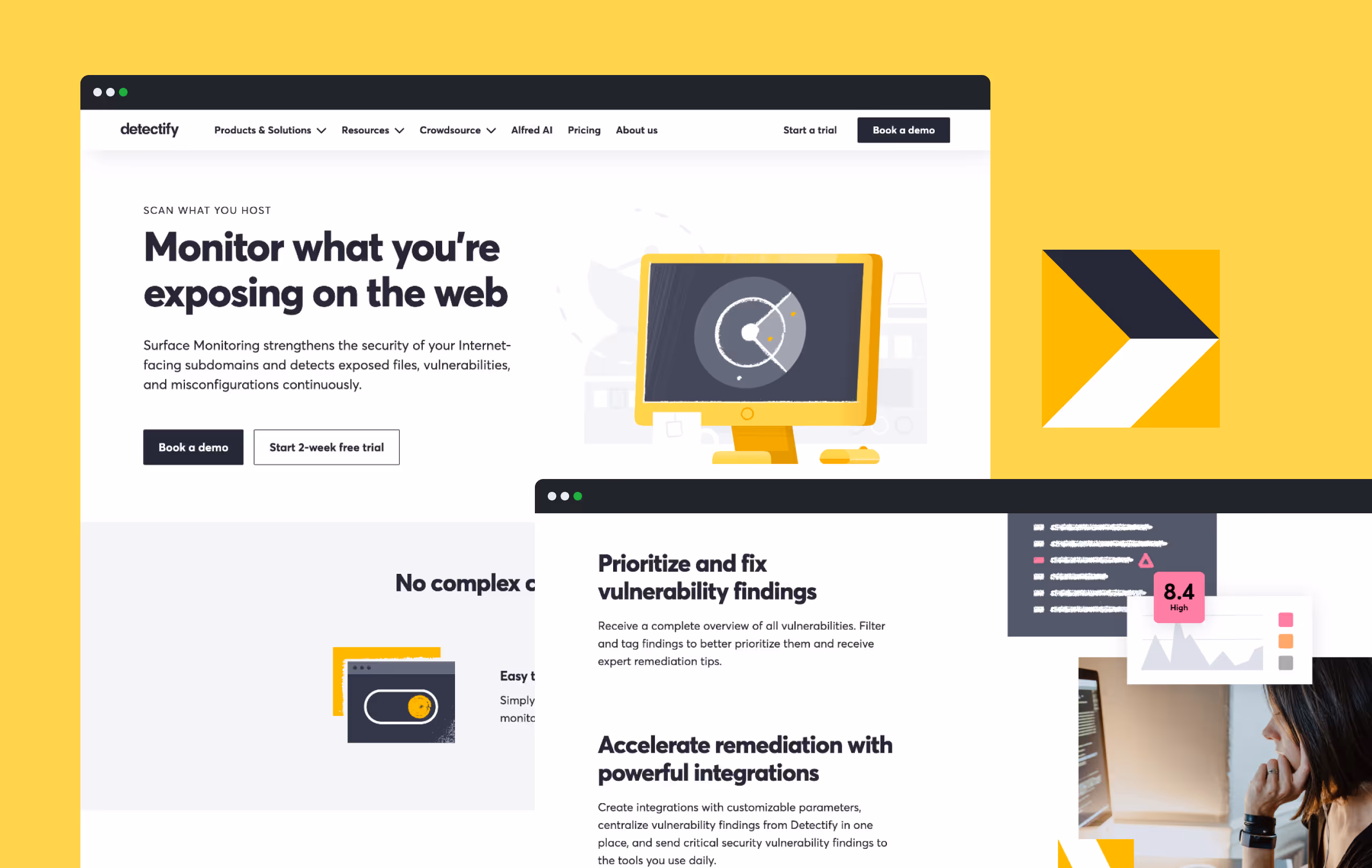
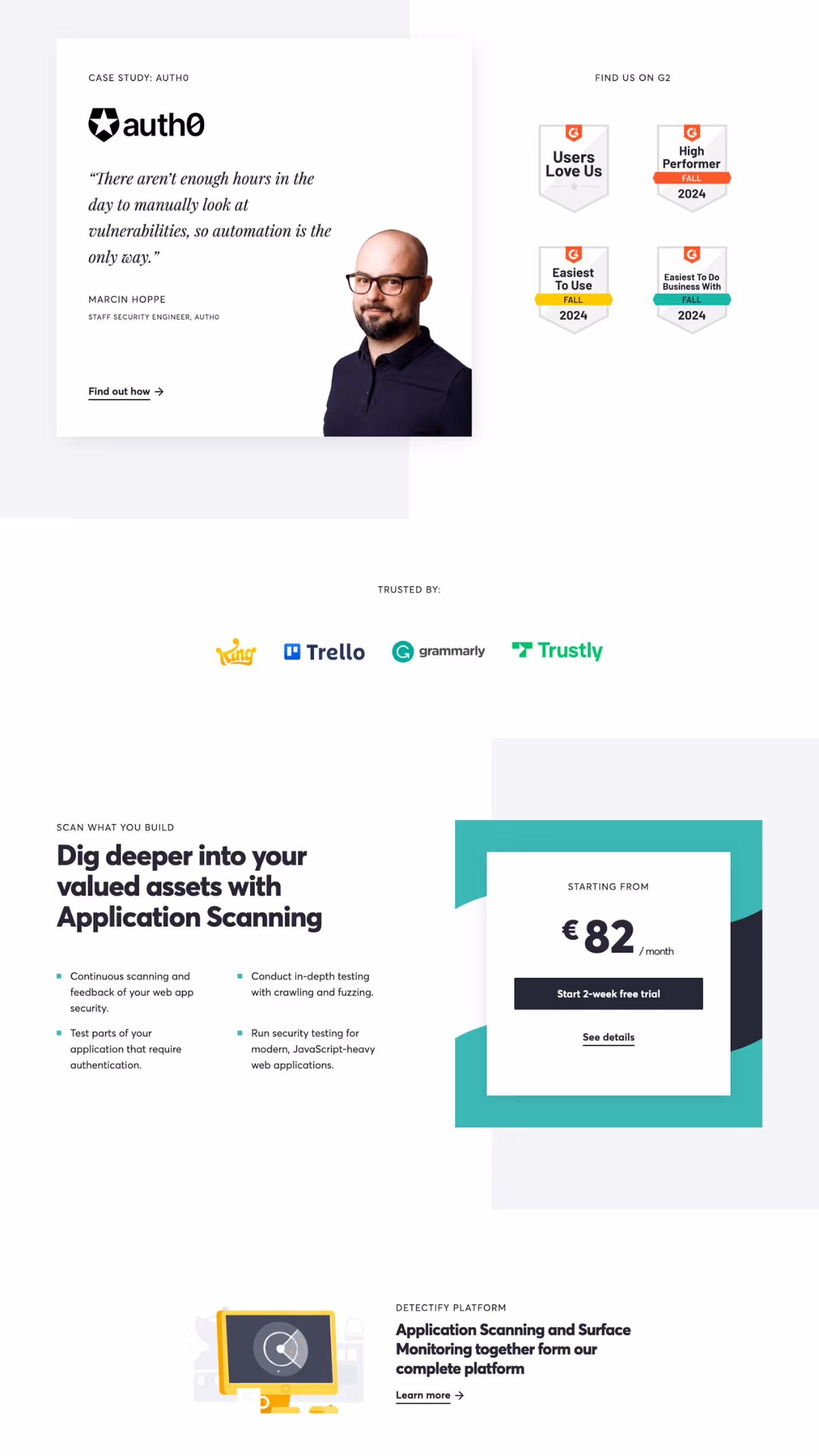
One of the first things I did at Detectify was redesign and rebuild the website from scratch.
I moved it to my favorite flat-file CMS, "Statamic", which made updates and version control way less of a hassle. As the company evolved, I updated the site to match new branding—and while some has changed, large parts of my original design is still live today.
Rebranding Detectify
During my time on the marketing team, I was part of a two man design team tasked with rebranding Detectify. The goal was to evolve the brand into something more grown up—cleaner, more polished, and a better fit for the space we were in as a growing SaaS company.
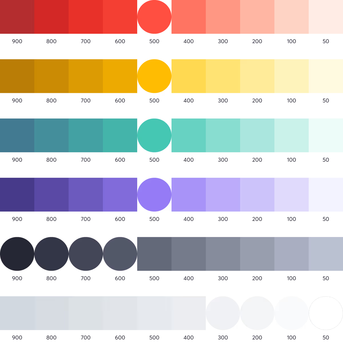
Colors
I refined the existing brand colors, added tints and shades. To balance the bolder brand colors, gray tones were defined to use for backgrounds, UI elements, and text.


Typography
The typeface i chose was Averta—bold enough to add character to headings, but still clean and grown up. We tightened the typography system with clear rules to keep things consistent across product and marketing.

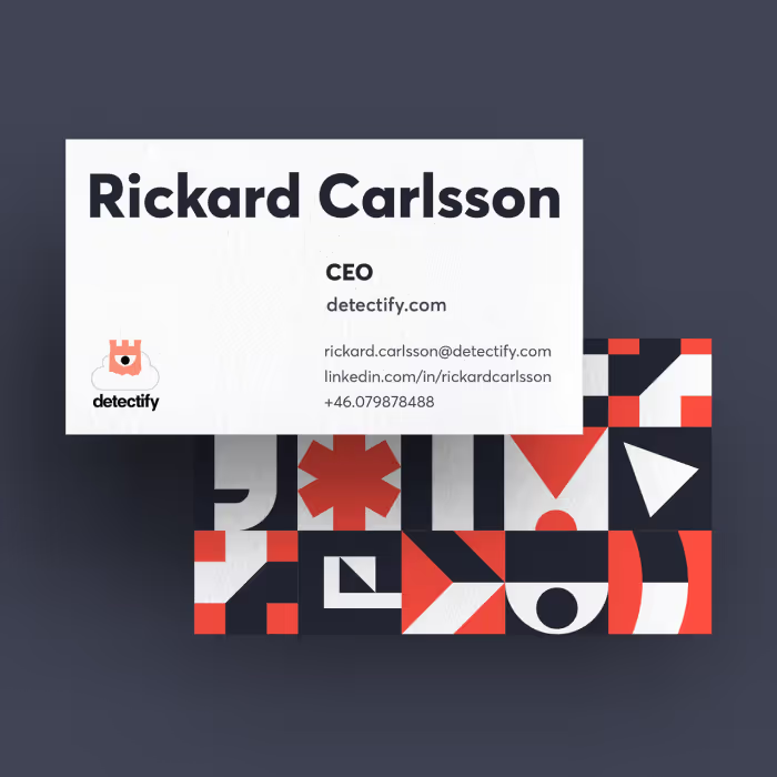
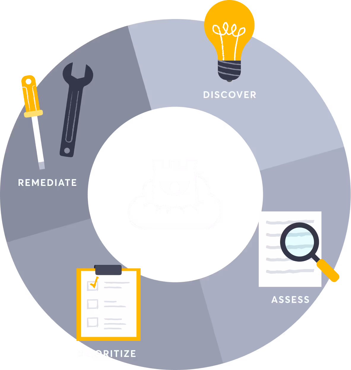
Pattern shapes
We needed something to tie things together. Something that would say “Detectify” at a glance. What we came up with was a pattern—a set of shapes that could be used on their own or layered with imagery. They showed up everywhere, and still do, across all things Detectify.


The pattern came in our main brand colors, plus an extra purple used exclusively for Crowdsource—Detectify’s white hat hacker program. A small detail, but one that helped us keep things organized and purposeful.
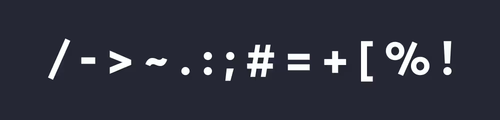
We based the shapes on common programming symbols, mixed with a few filler forms to balance it all out. A small nod to the tech world we were building for, and a subtle way of keeping that context present across our brand.

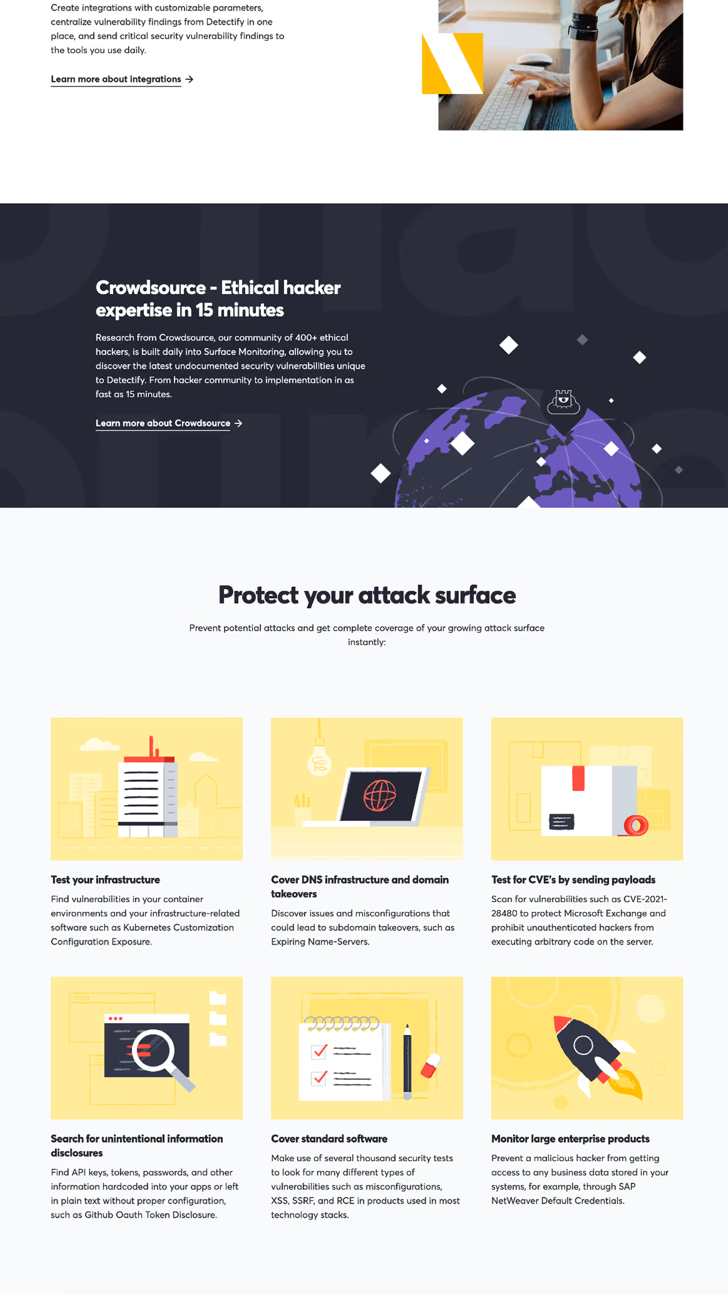
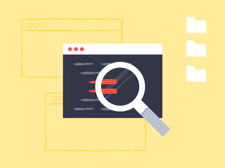
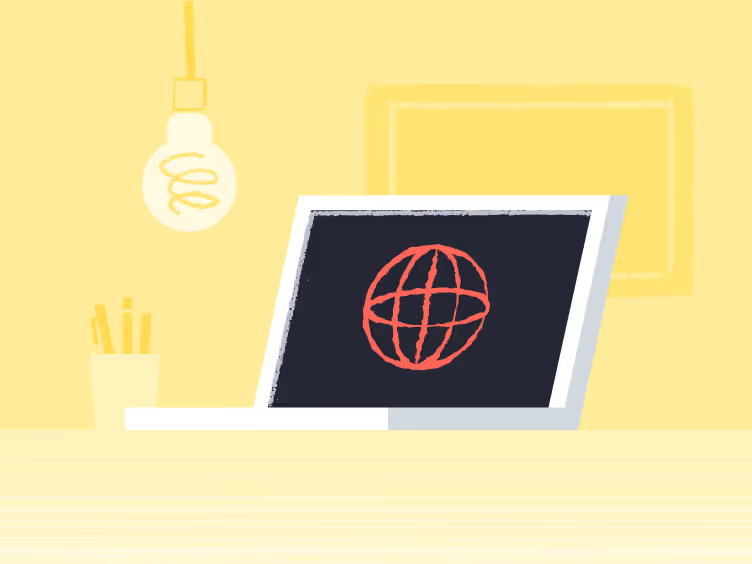
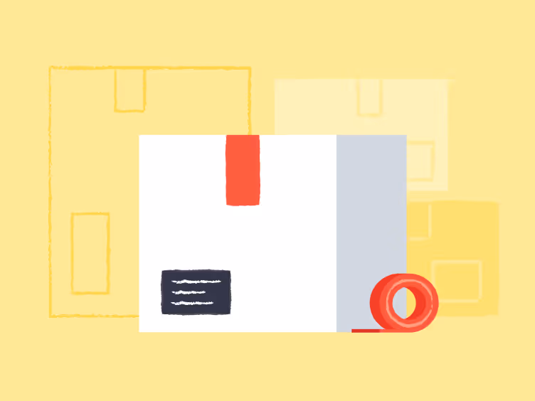
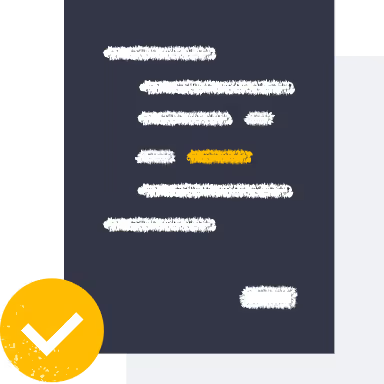
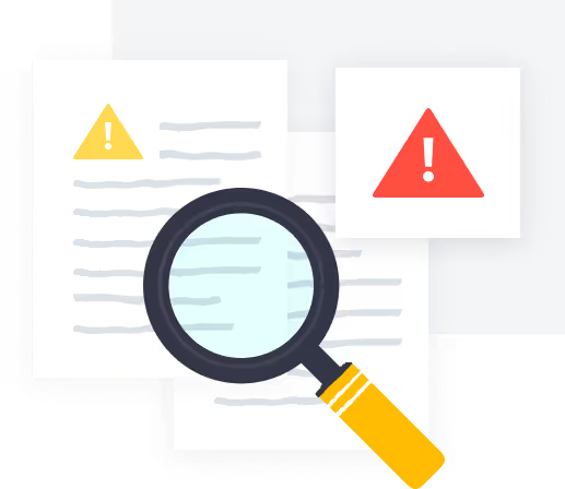
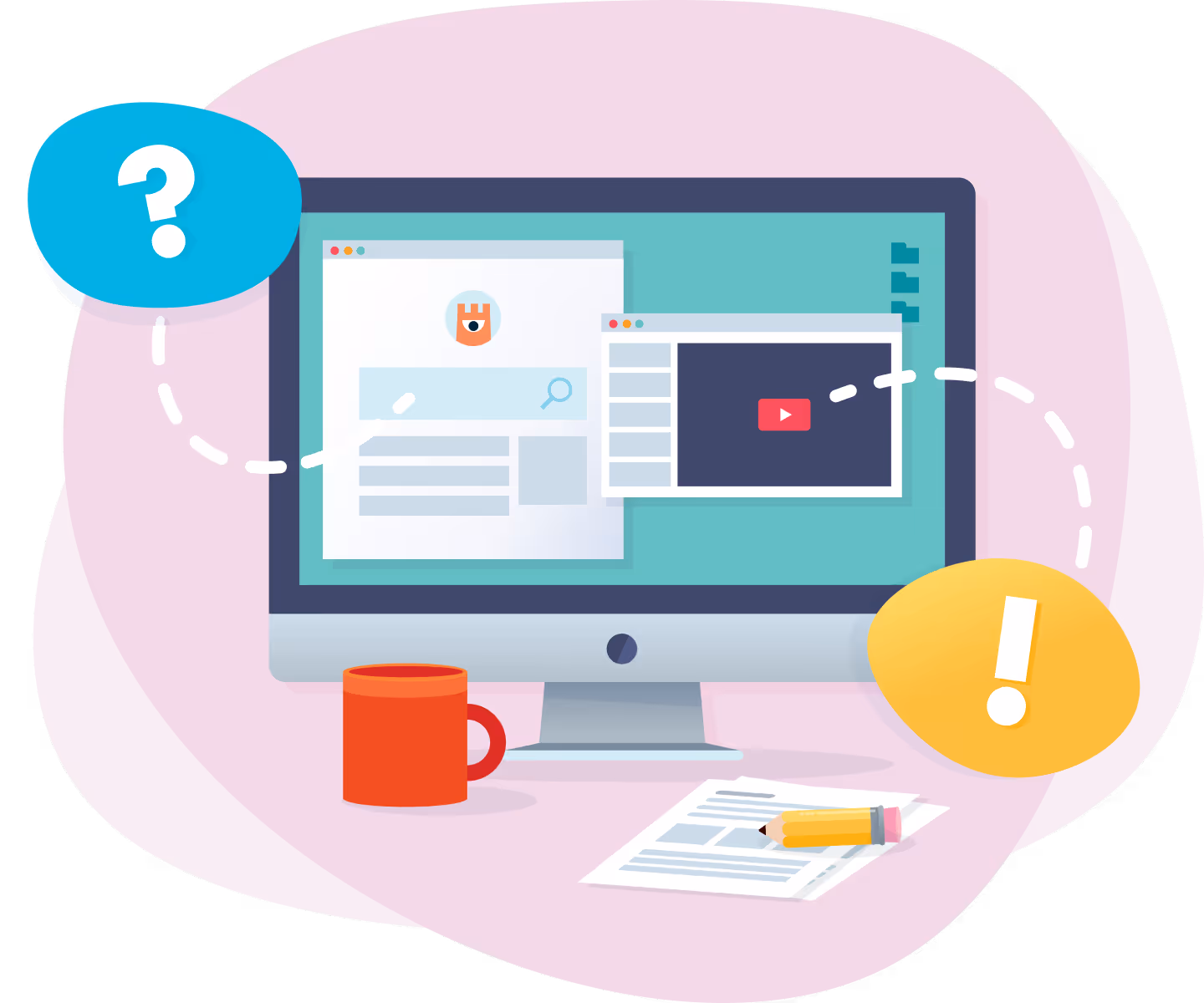
Illustrations
During the rebrand, we gave our graphics a full overhaul—flatter illustrations, subtle textures, hand-drawn elements, and a much more limited color palette that reflected the new brand. Corners got sharp. Imagery got simpler. Many of these newer illustrations I made are still live on the site today.


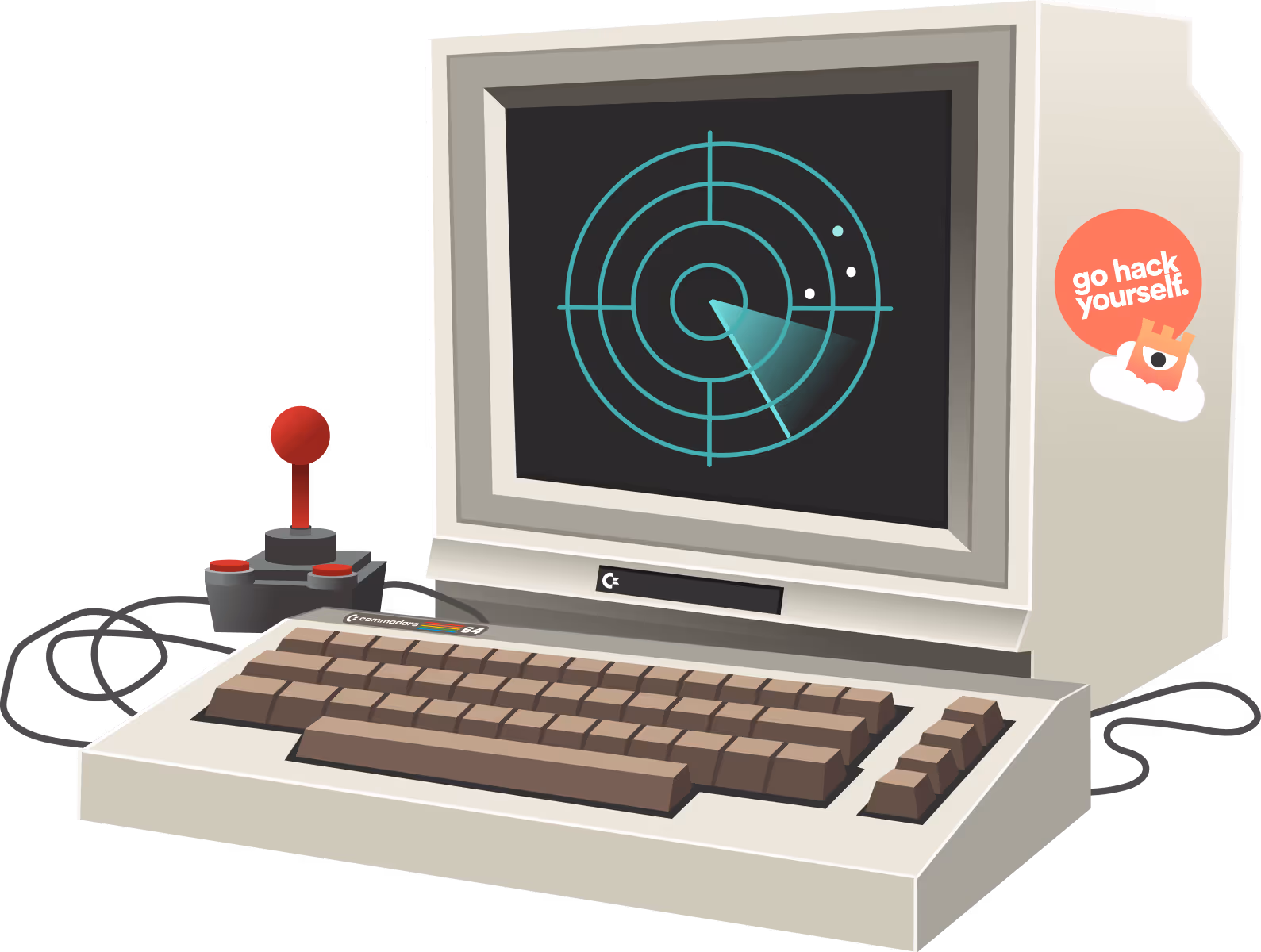
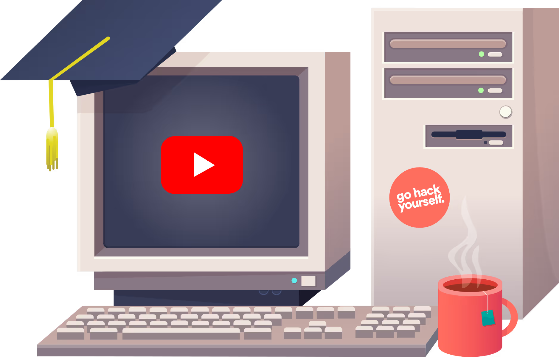
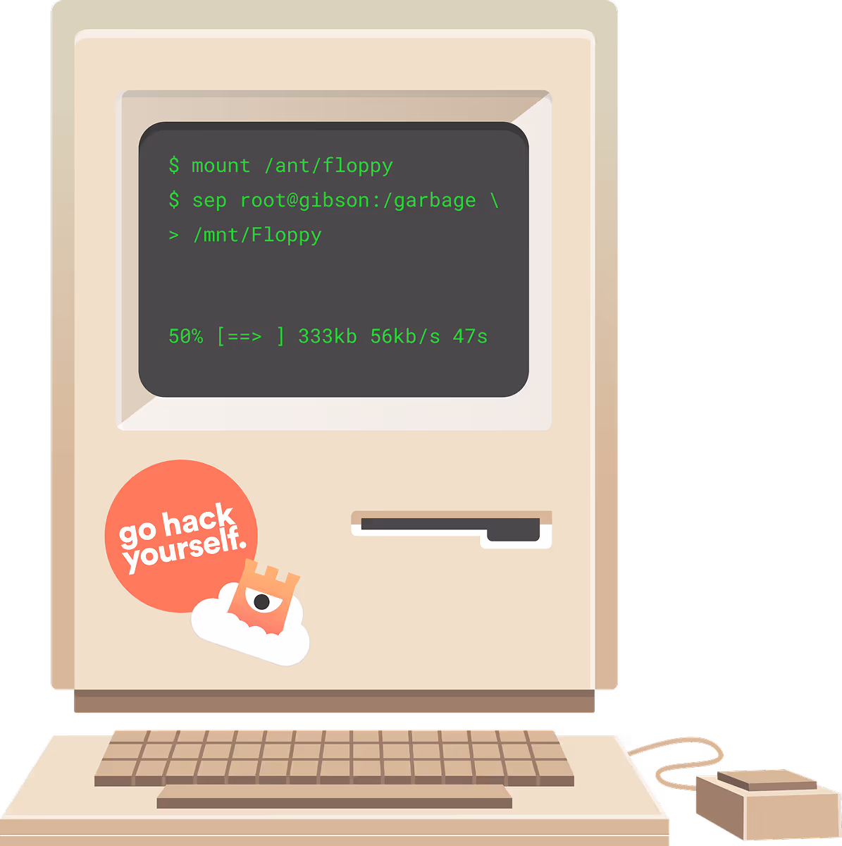
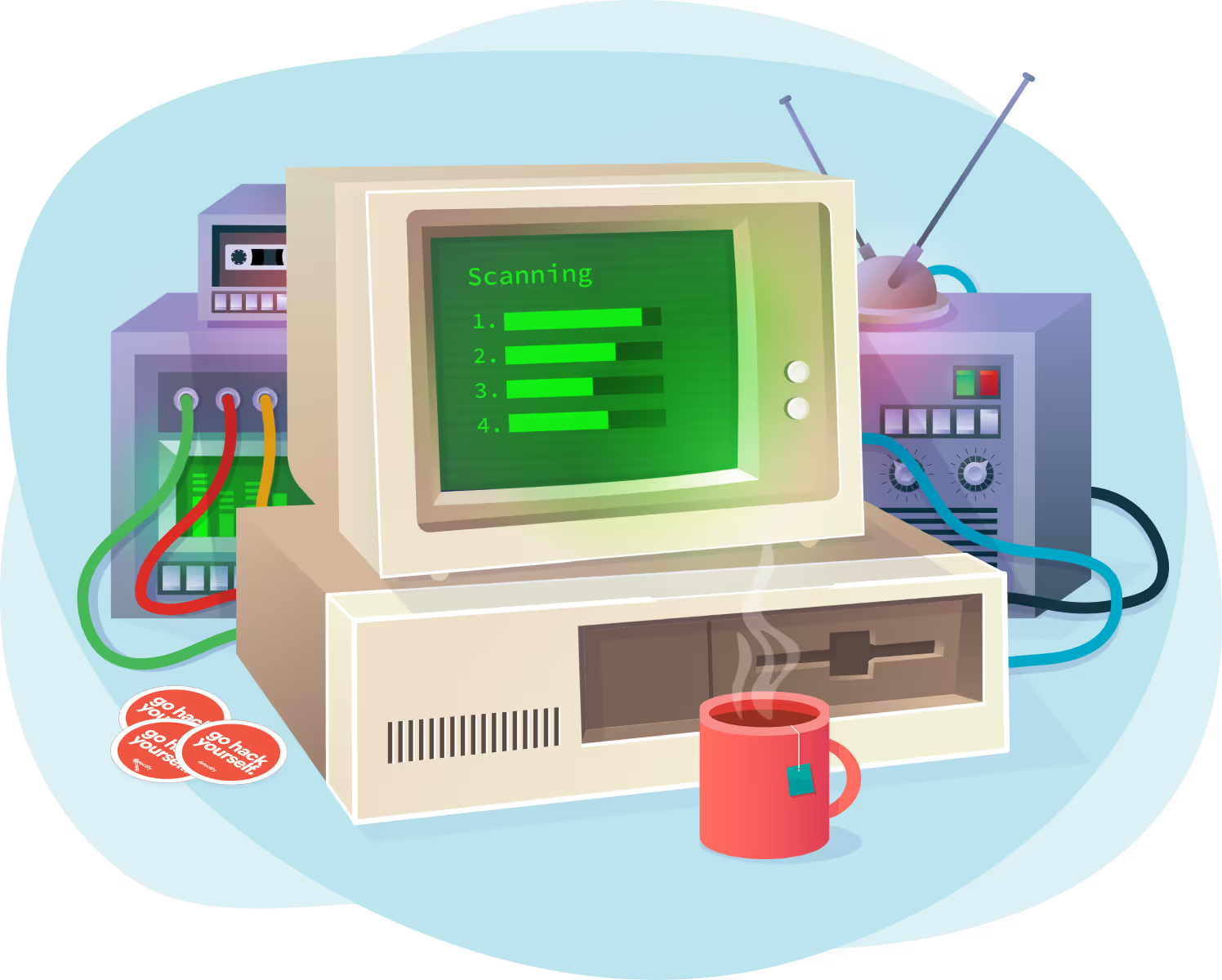
Early days throw back
The early days of Detectify was very different. We were all about bold colors and cartoon-style illustrations. Lots of retro equipment, chunky computers, quirky tech gadgets, robots, and random things. I made a lot of these. We also had a “blob shape phase” (like most of the internet at the time). And gradients. So many gradients. It was a fun, slightly chaotic time—and even if we outgrew the style, it helped shape the early personality of the brand.


I was at Detectify for over six years, and during that time I had a hand in almost every corner of the visual output. A lot has changed since then—but it’s nice knowing that parts of my work are still alive in the product, the website, and the brand today.