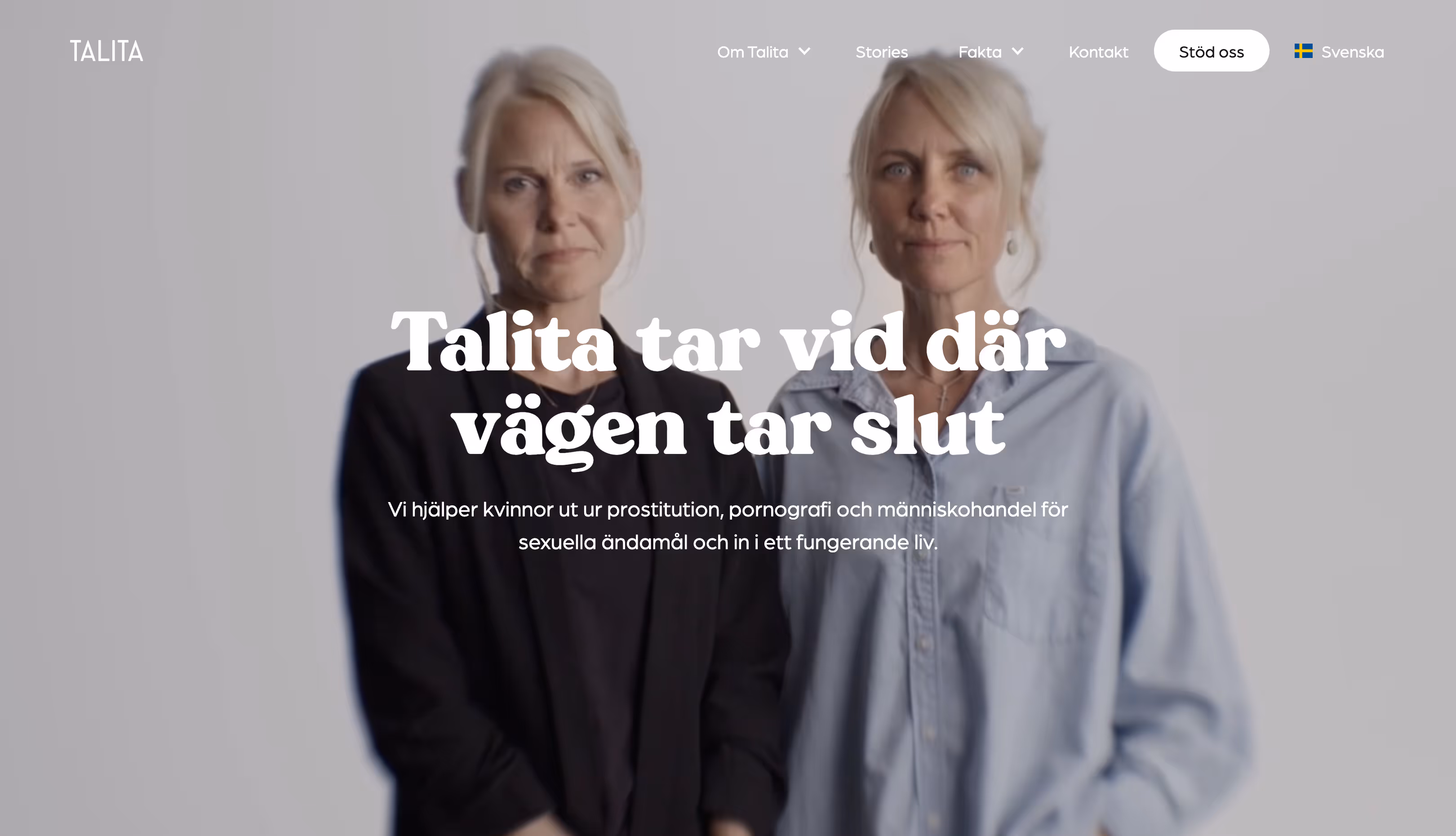
Website Design & Development
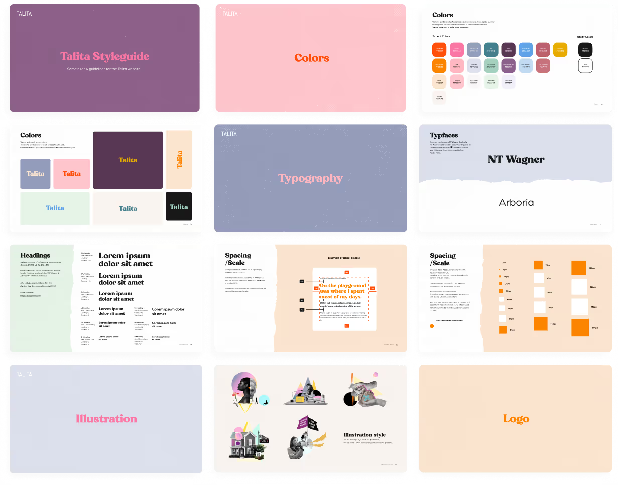
For the latest version, I took on both design and development, collaborating closely with Talita’s Creative Director. He had a clear vision: bold, colorful, and artsy. We ran with that direction and created a vibrant, expressive fun site that still feels clear, structured, and easy to navigate.
Typography Refresh
I chose new typefaces for both headings and body text — something with a bit of pizazz and playfulness, while still being easy to read.

Color Overhaul
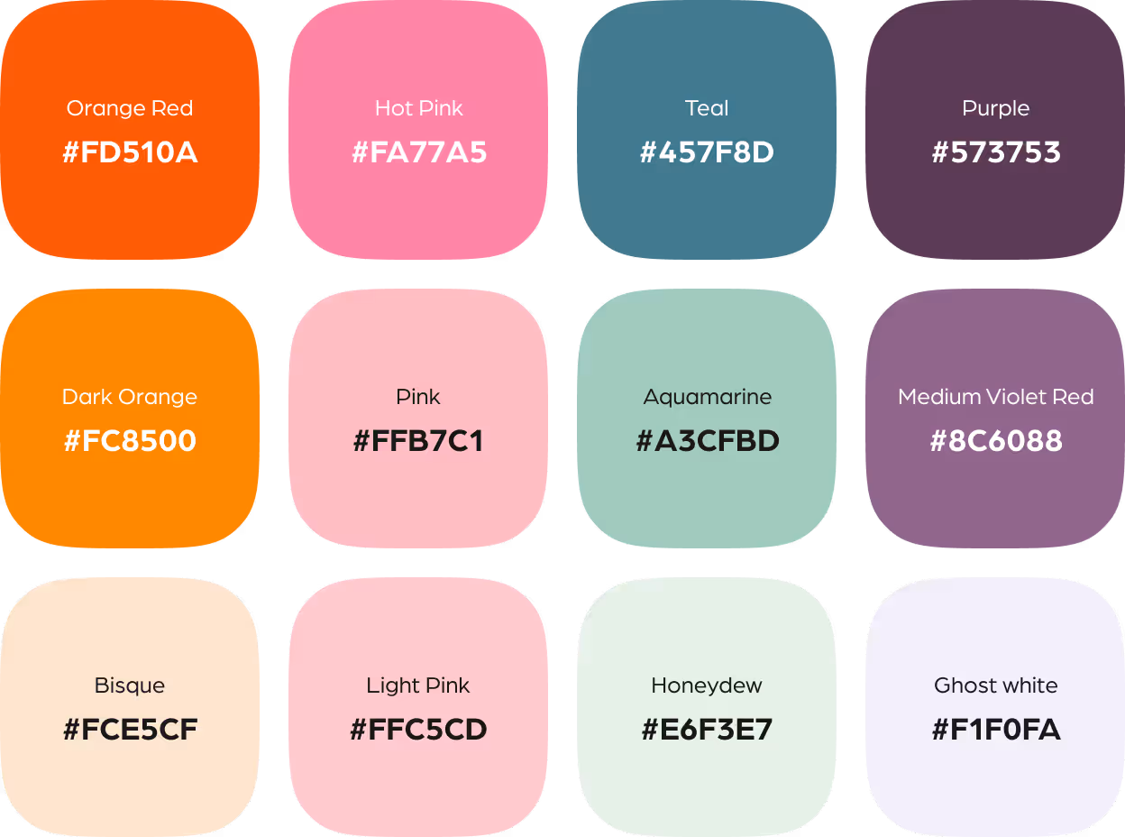
Talita already had a strong set of brand colors, but I refined the palette to improve usability and consistency. I removed hues that were too similar, added complementary tones, and introduced a range of shades and tints to give the site more depth and flexibility.
Taming the Creative Chaos
Talita’s brand shifts a lot depending on context—fun but tricky to manage. I created a web-focused style guide to bring clarity to typography, color, logo use and illustration, helping them maintain consistency without losing the brand’s personality.
fin.
More projects