Out with the old...
When I joined Plant, my first task was their website—and quickly, their brand.
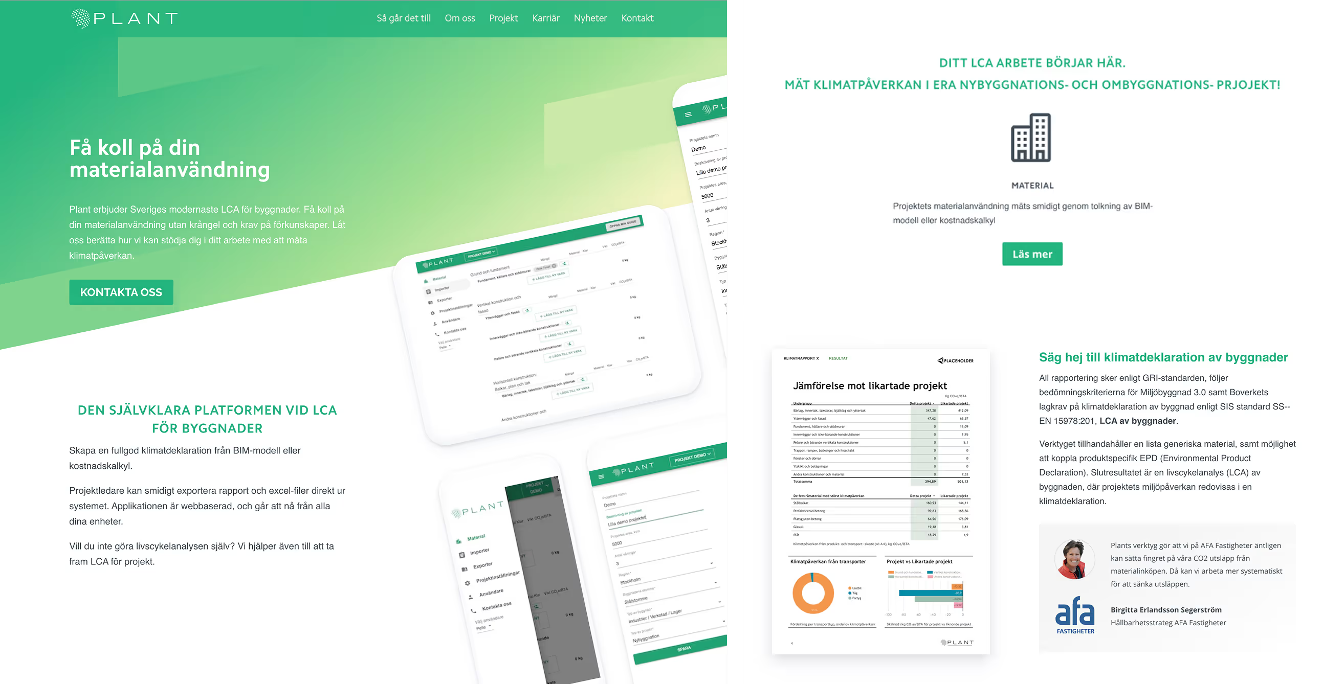
They wanted to move away from the green palette they’d never liked and adopt a more serious, professional look. The site was a bit of a mess: inconsistent spacing, clashing typography, and outdated content. What began as a website update soon became a full rebrand of Plant.
In with the new
After a visual audit of everything Plant had brandwise, I started reworking the foundation—from colors and typography to tone and structure. The goal was to create a look that felt more mature, modern, and aligned with where the company stood and where it was going.
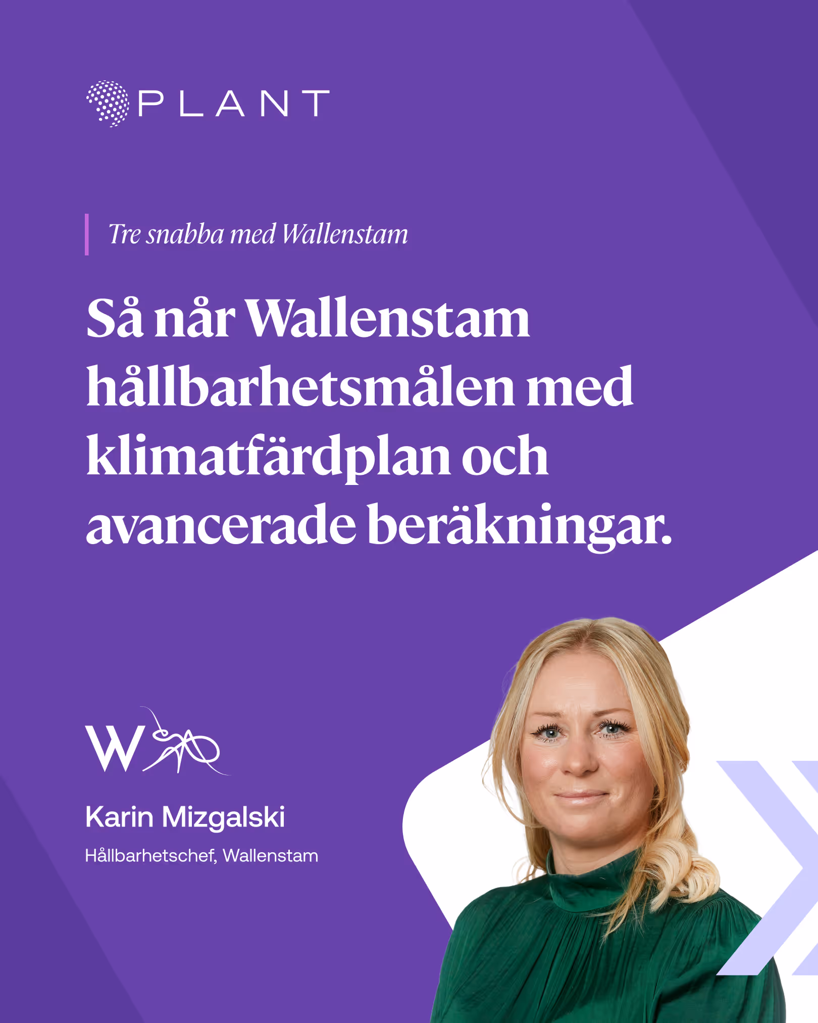
A new coat of color
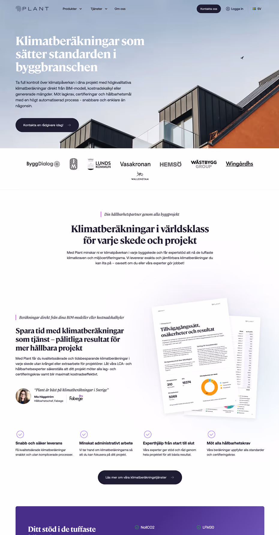
I explored a range of directions before landing on a rich purple as the core brand color—strong, distinctive, and a clear departure from the old green. I paired it with a lighter tone for flexibility, and built out a full system of tints, shades, and grayscale to be used for the website and marketing.


Type That Fits
For headings, I chose Cambon—bold, stylish, and confident. For body copy, I picked Aeonik. It’s clean, modern, and easy to read, but still has a bit of personality. Together, they gave the brand a more grown-up feel without making it boring.


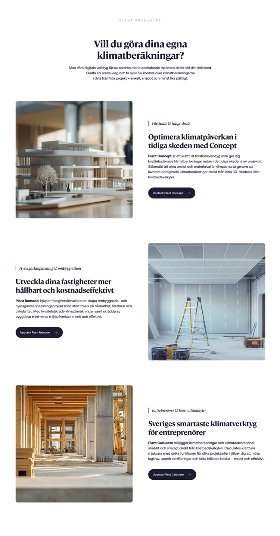
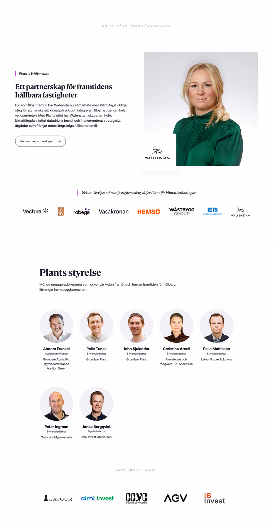
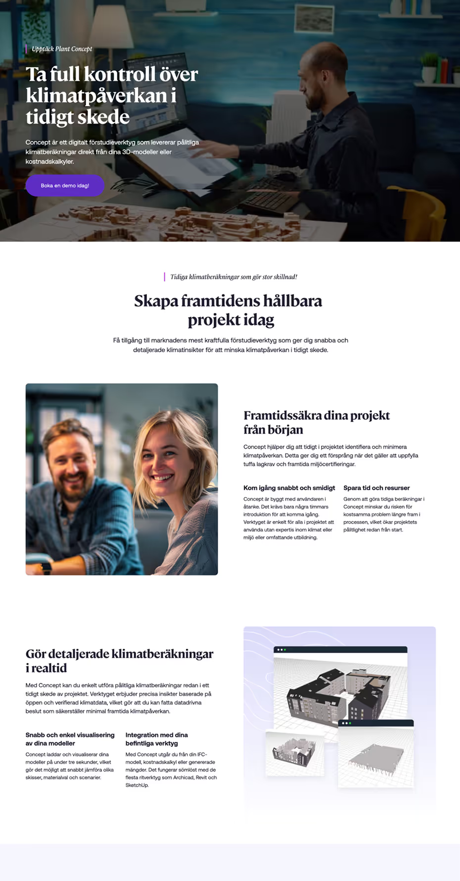
A New Look, Built for Growth
I designed and built the website from the ground up in Webflow CMS. I aimed for something calm, confident, and clear—conveying trust and structure. More whitespace, subtle grays and gradients. A cleaner layout. More descriptive headings, fewer walls of text, and a more SaaS-style structure with sections like “Product” and “Solutions.” That setup leaves room to grow, making it easy to expand as the offering evolves. Webflow CMS gave editors plenty of control while keeping updates simple on my end.


thx.
More projects