The brief & process
The band came prepared — tons of (sometimes conflicting) ideas, references, and creative chaos. Everything from race car graphics, vintage match stick graphics and gritty music & horrorfilm posters to “something you can gaffer-tape onto a bass drum.”
Sifting through all these ideas, I explored a few different directions and created several early sketches/ideas that we eventually decided to scrap.


Settling on the look
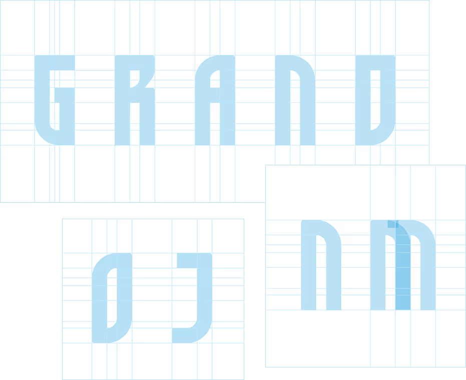
In the end, we landed on going for something cleaner and more blocky. Drawing inspiration from — and paying homage to — the lettering styles of some old 70s/80s movie & music posters we all liked, I set out to create and refine custom letter shapes for the logo.
The result
The final logo was clean, versatile, and easy for the band to use in different ways — whether they wanted to rough it up or keep it sharp and minimal. I delivered two interchangeable versions of the logo to give them flexibility. They were happy. I was happy.


Out in the wild
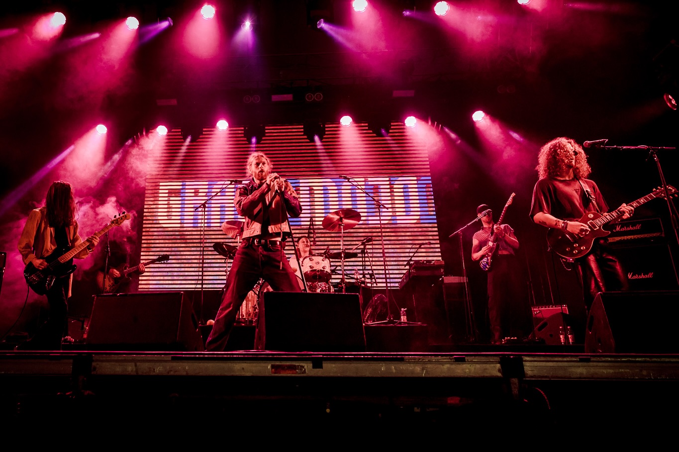
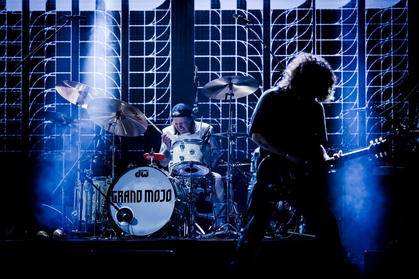
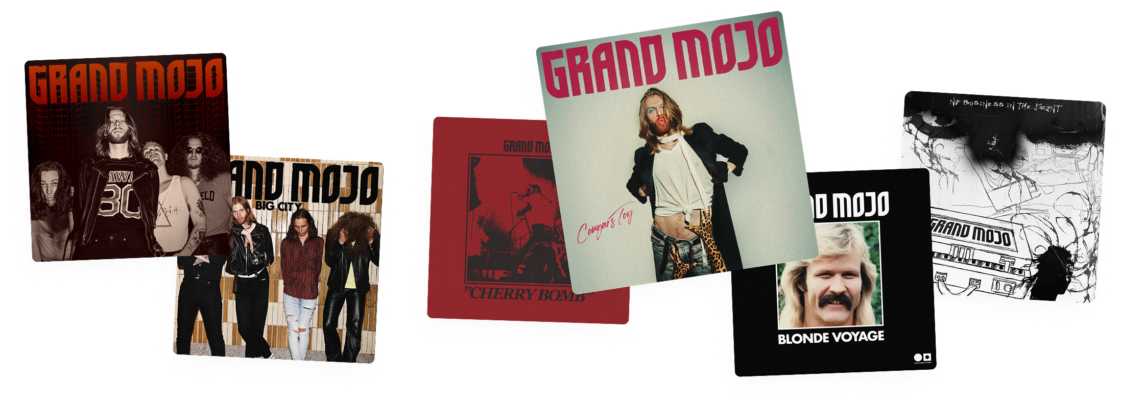
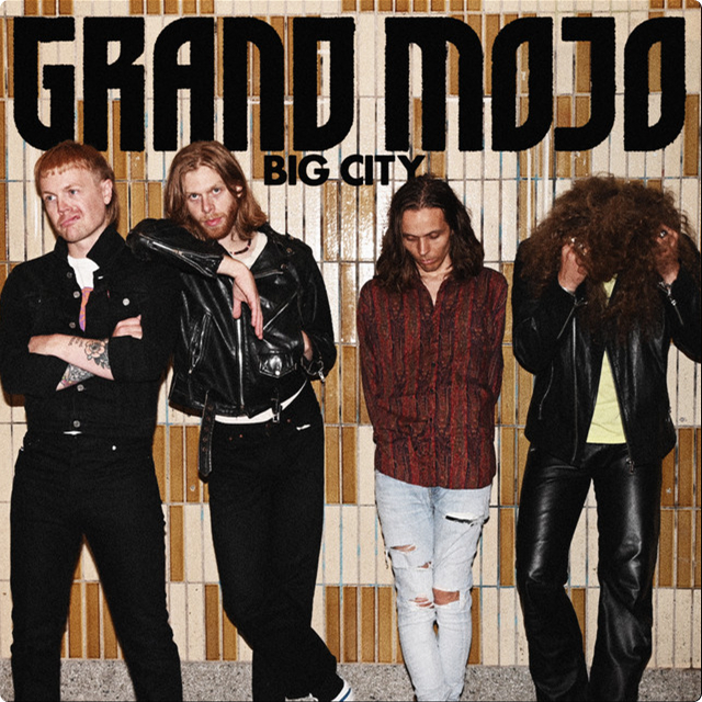
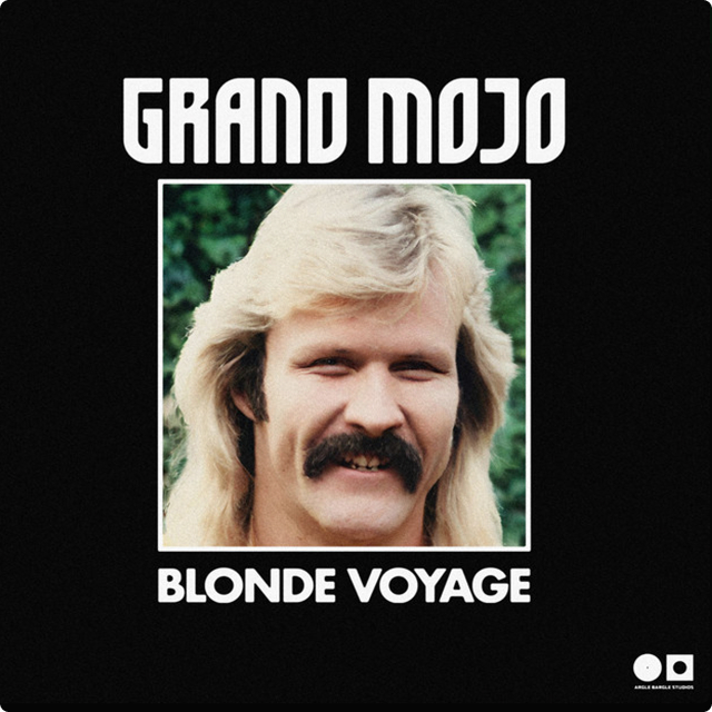
The band has been using the logo across all kinds of materials — backdrops, album art, merch, and more. A few examples below:
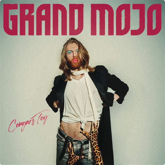
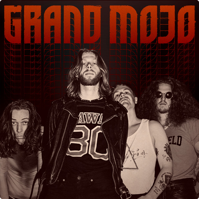
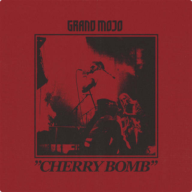
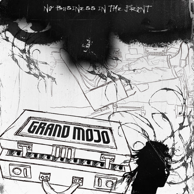
...mic drop
All in all, a fun and creative process — big thanks to Grand Mojo for trusting me with their visual identity. Now go check out their music!


